Image and Content Fader Code:
This is for the code that we used for each slide in the S5 Image and Content Fader module. Titles are entered in the specified module fields.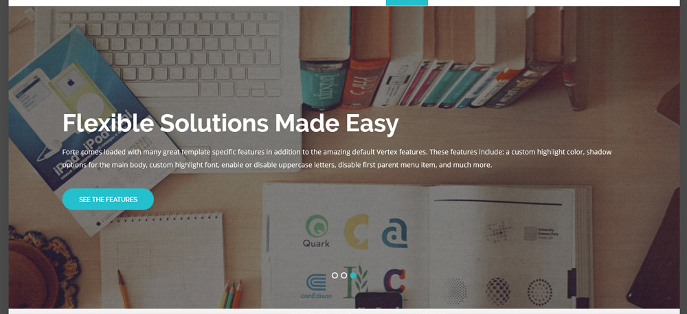
<br />
<a class="readon" target="_blank" href="http://www.shape5.com/joomla/framework/vertex_framework.html">Learn More</a>
Icon Boxes:
These can be published to any position as a custom html module with no module class applied. Ion Icons must be enabled in the template configuration.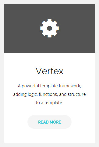
<i class="ion-gear-b"></i>
</div>
<div class="icon_text">
<h3>Vertex</h3>
A powerful template framework, adding logic, functions, and structure to a template.
<br />
<a href="index.php/features-mainmenu-47/template-specific-features" class="readon readon_grey">Read More</a>
</div>
Join Button:
This should be published to the custom_2 position as a custom html module with no module class applied.
Join For Free To Download This Template
<br style="display:none" class="line_break">
<a class="readon readon_black" target="_blank" href="http://www.shape5.com/join-now.html">Download Now</a>
</div>
Social Icons:
This should be published to any bottom_row3 position as a custom html module with no module class applied. Ion Icons must be enabled in the template configuration.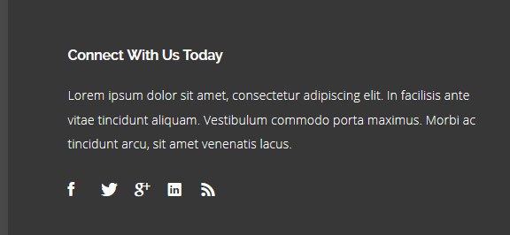
<br><br>
<a href="http://www.facebook.com/shape5.templates" target="_blank" class="social_icon ion-social-facebook"></a>
<a href="javascript:;" class="social_icon ion-social-twitter"></a>
<a href="javascript:;" class="social_icon ion-social-googleplus"></a>
<a href="javascript:;" class="social_icon ion-social-linkedin"></a>
<a href="javascript:;" class="social_icon ion-social-rss"></a>
- Details
- Written by Admin
Round icon example:
<div class="icon_hover">
<a href="" class="ion-link icon_element"></a>
</div>
<div class="icon_non_hover">
<span class="ion-headphone icon_element"></span>
</div>
</div>
Icon Examples:
View Full Cheatsheet (all CSS classes)
- Details
- Written by Admin
Example of this in action (refresh this page if you didn't see it already):
Code used for the above:
<div data-scroll-reveal="enter from the bottom after 1s"> Enter from the bottom after 1 second. </div>
<div data-scroll-reveal="wait 2.5s and then ease-in-out 100px"> Wait 2.5 seconds and then ease-in-out 100px. </div>
Usage:
For a lengthier explanation on this visit the following page: https://github.com/julianlloyd/scrollReveal.js- Details
- Written by Admin
- Details
- Written by Admin
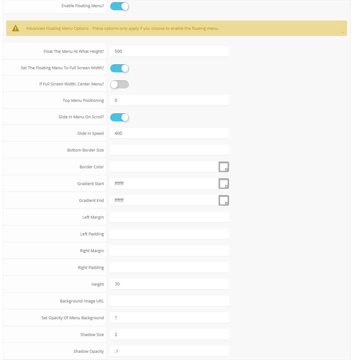
Features at a glance:
- Set a background image to the menu, gradient or solid color
- Set to snap or smooth scroll in
- Determine at which point as you scroll down your page that the menu drops in
- and many more features, just check out the screenshot below
Admin area of the floating menu:
- Details
- Written by Admin
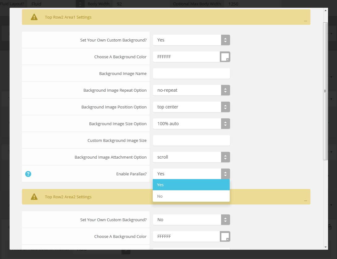
Features:
- Set the scroll speed of the images
- Set background repeat style
- Set background image size, 100%, cover, contain, etc
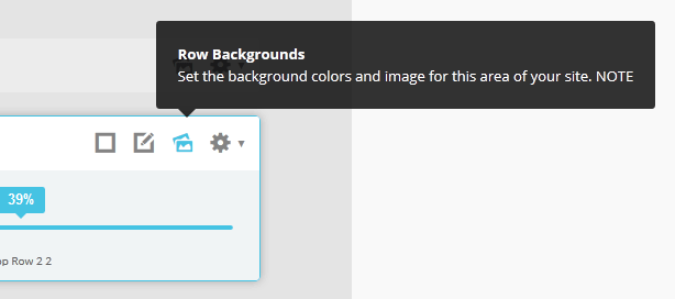
- Set custom backgrounds for all s5 rows in the framework.
- Enable or disable parallax on a per row basis
Admin Area Of The Backgrounds Tab:
- Details
- Written by Admin
Drop Caps
L orem ipsum dolor sit amet, consectetur adipiscing elit. Mauris tristique lobortis orci ac lacinia. Fusce eu purus eget diam vehicula auctor nec eu elit. Morbi consequat facilisis orci vel malesuada. Donec ultrices molestie sollicitudin. Morbi consequat facilisis orci vel malesuada. Donec ultrices molestie sollicitudin. Mauris tristique lobortis orci ac lacinia. Mauris tristique lobortis orci ac lacinia.
L orem ipsum dolor sit amet, consectetur adipiscing elit. Mauris tristique lobortis orci ac lacinia. Fusce eu purus eget diam vehicula auctor nec eu elit. Morbi consequat facilisis orci vel malesuada. Donec ultrices molestie sollicitudin. Morbi consequat facilisis orci vel malesuada. Donec ultrices molestie sollicitudin. Mauris tristique lobortis orci ac lacinia. Mauris tristique lobortis orci ac lacinia.
Porem ipsum dolor sit amet, consectetur adipiscing elit. Mauris tristique lobortis orci ac lacinia. Fusce eu purus eget diam vehicula auctor nec eu elit. Morbi consequat facilisis orci vel malesuada. Donec ultrices molestie sollicitudin. Morbi consequat facilisis orci vel malesuada. Donec ultrices molestie sollicitudin. Mauris tristique lobortis orci ac lacinia. Mauris tristique lobortis orci ac lacinia.
Porem ipsum dolor sit amet, consectetur adipiscing elit. Mauris tristique lobortis orci ac lacinia. Fusce eu purus eget diam vehicula auctor nec eu elit. Morbi consequat facilisis orci vel malesuada. Donec ultrices molestie sollicitudin. Morbi consequat facilisis orci vel malesuada. Donec ultrices molestie sollicitudin. Mauris tristique lobortis orci ac lacinia. Mauris tristique lobortis orci ac lacinia.
Video Overlay
The Video Above Is Not Included And May Be Downloaded From: http://www.videvo.net/video/working-on-laptop-1/3517
1. Enter the url of your video in the video src area.
2. Enter your background image under the video_overlay_wrap style area. This is the background image that appears before the video loads and at 1024px. Please note that all videos disable at 1024px due to restrictions on tablets and phones.
3. Enter an optional max-height under the video_overlay_wrap style area. This will prevent the video from becoming larger than the height specified.
4. Enter an optional min-height under the video_overlay_wrap style area. This will prevent the video from becoming smaller than the height specified. This is very useful for when the video is disabled at 750px, and the background image shows in its place.
4. Enter an optional width under the video_overlay_wrap style area. This will stretch the video to a specified length, but will be cropped off by the surrounding parent div.
4. Enter your desired text in the video_overlay_text_wrap_inner area. Text should be minimal to avoid any space issues on smaller screens; videos maintain ratio and decrease on smaller devices.
<video muted autoplay="autoplay" loop="loop" src="/images/video.mp4"></video>
<div class="video_overlay_text_wrap">
<div class="video_overlay_text_wrap_inner">
Lorem ipsum dolor sit amet, consectetur adipiscing elit. Morbi efficitur scelerisque ligula, sit amet fermentum metus.
<div style="clear:both;height:0px;"></div>
</div>
</div>
</div>
Social Icons
Ion Icons must be enabled to use these icons.
<a href="/" class="social_icon ion-social-twitter"></a>
<a href="/" class="social_icon ion-social-googleplus"></a>
<a href="/" class="social_icon ion-social-rss"></a>
<a href="/" class="social_icon ion-social-pinterest"></a>
Notifications
Images
This is an image with the "boxed" class applied:
This is an image with the "boxed_white" class applied:
This is an image with the "boxed_black" class applied:
This is an image with the "padded" class applied:
This is an image with the "full_width" class applied. This can also be done automatically in the template configuration. Be sure to review our Vertex Guide here for other full width image options.

Headings
Heading 1
Heading 2
Heading 3
Heading 4
Heading 5
Ion Icons
<div class="icon_hover">
<a href="/" class="ion-link icon_element"></a>
</div>
<div class="icon_non_hover">
<span class="ion-headphone icon_element"></span>
</div>
</div>
Click here for more icon examples
Dates
<div class="date_wrapper">
<div class="date_top">
AUG
</div>
<div class="date_bottom">
22
</div>
</div>
<div class="date_text_wrap">
<span class="date_text1"><a href="/">Top Sample Text</a></span>
<span class="date_text2">When: August 22, 2014 at 7:00pm</span>
</div>
<div style="clear:both"></div>
</div>
Overlay
Michelle Wright
Senior Developer

Photos credits by Daniele Zedda, JohnONolan, Daniele Zedda, Daniele Zedda, AllansBrain, rolands.lakis
<div class="overlay_outer four">
<div class="overlay_inner">
<div class="overlay_hover_outer">
<div class="overlay_hover_inner">
<div class="overlay_socialicons">
<a class="overlay_facebook" href="https://www.facebook.com/shape5.templates" target="_blank"></a>
<a class="overlay_twitter" href="https://twitter.com/shape_5" target="_blank"></a>
</div>
</div>
<img src="http://www.shape5.com/demo/images/general/team/team1.jpg" alt="team1"/>
</div>
<br>
Mike Summerfield
<br>
<span style="color:#a8a8a8;">CEO/Owner</span>
<br> </div>
</div>
Video Play Overlay
<div class="overlay_hover_outer">
<div class="overlay_hover_video">
<div class="overlay_centered">
<a href="http://www.youtube.com/v/VGiGHQeOqII" id="youtube" class="s5mb" title="Youtube.com Video">
<span class="ion-play ion-play-size"></span>
</a>
<div class="s5_multibox youtube">UP: Carl and Ellie </div>
</div>
</div>
<img src="http://www.shape5.com/demo/images/general/typography_vidplay.jpg" alt="iphone vid" />
</div>
</div>
Image Hover Zoom
<div class="image_hover_zoom_text">
Overlay Text
</div>
<img src="http://www.shape5.com/demo/images/general/typography_vidplay.jpg" alt="" />
</div>
Misc
<a> With readon class applied:readon
<a> With readon and readon_grey class applied:
readon_grey
<a> With readon readon_black class applied:
readon_black
<span> With uppercase class applied:
uppercase
This is a sample blockquote. Use <blockquote><p>Your content goes here!</p></blockquote> to create a blockquote.
#s5_code { width: 30px; color: #fff; line-height: 45px; }
- This is an Ordered List
- Congue Quisque augue elit dolor nibh.
- Condimentum elte quis.
- Opsum dolor sit amet consectetuer.
- This is an Unordered List
- Congue Quisque augue elit dolor nibh.
- Condimentum elte quis.
- Opsum dolor sit amet consectetuer.
- This is an Unordered List with class ul_arrow
- Congue Quisque augue elit dolor nibh.
- Condimentum elte quis.
- Opsum dolor sit amet consectetuer.
- This is an Unordered List with class ul_star
- Congue Quisque augue elit dolor nibh.
- Condimentum elte quis.
- Opsum dolor sit amet consectetuer.
- This is an Unordered List with class ul_bullet
- Congue Quisque augue elit dolor nibh.
- Condimentum elte quis.
- Opsum dolor sit amet consectetuer.
The following list will support plain text such as numbers of ion icons, class="ul_circle_content":
- 01Lorem ipsum dolor sit amet, consectetur adipiscing elit. Sed ut mattis quam. Suspendisse tempor mollis porta. Quisque consequat justo risus, et venenatis erat consectetur sit amet. Curabitur varius tortor metus, non convallis felis fermentum sed. Nam varius justo nulla, et ultricies augue venenatis ut. Proin tempor aliquam dapibus. Pellentesque euismod vehicula est, a euismod lacus feugiat sit amet.
- 02Lorem ipsum dolor sit amet, consectetur adipiscing elit. Sed ut mattis quam. Suspendisse tempor mollis porta. Quisque consequat justo risus, et venenatis erat consectetur sit amet. Curabitur varius tortor metus, non convallis felis fermentum sed. Nam varius justo nulla, et ultricies augue venenatis ut. Proin tempor aliquam dapibus. Pellentesque euismod vehicula est, a euismod lacus feugiat sit amet.
- 03Lorem ipsum dolor sit amet, consectetur adipiscing elit. Sed ut mattis quam. Suspendisse tempor mollis porta. Quisque consequat justo risus, et venenatis erat consectetur sit amet. Curabitur varius tortor metus, non convallis felis fermentum sed. Nam varius justo nulla, et ultricies augue venenatis ut. Proin tempor aliquam dapibus. Pellentesque euismod vehicula est, a euismod lacus feugiat sit amet.
- Lorem ipsum dolor sit amet, consectetur adipiscing elit. Sed ut mattis quam. Suspendisse tempor mollis porta. Quisque consequat justo risus, et venenatis erat consectetur sit amet. Curabitur varius tortor metus, non convallis felis fermentum sed. Nam varius justo nulla, et ultricies augue venenatis ut. Proin tempor aliquam dapibus. Pellentesque euismod vehicula est, a euismod lacus feugiat sit amet.
The following list will support lists up to number 9, add the following class to the UL wrapping the below LI elements, class="ul_numbers":
- This is a sample styled number list <li class="li_number1">Your content goes here!</li>
- This is a sample styled number list <li class="li_number2">Your content goes here!</li>
- This is a sample styled number list <li class="li_number3">Your content goes here!</li>
- This is a sample styled number list <li class="li_number4">Your content goes here!</li>
Price Table
<div class="s5_pricetable_3">
<div class="s5_pricetable_column">
<div class="s5_pricetable_column_padding">
<div class="s5_title">Basic</div>
<div class="s5_price_wrap">
<span class="dollarsign">$</span><span class="price">49</span><span class="month">/per month</span>
</div>
<div class="s5_options">
<div class="s5_option">
Unlimited Space & Traffic
</div>
<div class="s5_option">
99.9% Server Uptime
</div>
<div class="s5_option">
24/7 Customer Care
</div>
<div class="s5_option">
30 Days Money Back
</div>
</div>
<div class="s5_horizontalrule"></div>
<div class="s5_buttoncenter"><a class="button s5_pricetable" href="#">Choose</a></div>
</div>
</div>
<div class="s5_pricetable_column recommended">
<div class="s5_pricetable_column_padding">
<div class="s5_title">Standard</div>
<div class="s5_price_wrap">
<span class="dollarsign">$</span><span class="price">79</span><span class="month">/per month</span>
</div>
<div class="s5_options">
<div class="s5_option">
Unlimited Space & Traffic
</div>
<div class="s5_option">
99.9% Server Uptime
</div>
<div class="s5_option">
24/7 Customer Care
</div>
<div class="s5_option">
30 Days Money Back
</div>
<div class="s5_option">
FREE Domain Name
</div>
<div class="s5_option">
Personal Concierge
</div>
</div>
<div class="s5_horizontalrule"></div>
<div class="s5_buttoncenter"><a class="button s5_pricetable" href="#">Choose</a></div>
</div>
</div>
<div class="s5_pricetable_column">
<div class="s5_pricetable_column_padding">
<div class="s5_title">Premium</div>
<div class="s5_price_wrap">
<span class="dollarsign">$</span><span class="price">99</span><span class="month">/per month</span>
</div>
<div class="s5_options">
<div class="s5_option">
Unlimited Space & Traffic
</div>
<div class="s5_option">
99.9% Server Uptime
</div>
<div class="s5_option">
24/7 Customer Care
</div>
<div class="s5_option">
30 Days Money Back
</div>
</div>
<div class="s5_horizontalrule"></div>
<div class="s5_buttoncenter"><a class="button s5_pricetable" href="#">Choose</a></div>
</div>
</div>
<div style="clear:both;"></div>
</div>
Responsive YouTube and Vimeo Videos
Make any Youtube, Vimeo, etc video you embed to your site work with responsive by wrapping with a DIV with a class of "s5_video_container". The below Youtube Video will shrink when the area its contained in gets too small for it:- Details
- Written by Admin
Demo 1:

Demo 2:
Demo 2 Image Tool Tip
Demo 3:
Demo 3 Image Tool Tip
- Details
- Written by Admin
- 01In the backend of Joomla go menu item Extensions/Template Manager.
- 02Click on the title of the template.
- 03This will bring you to the template manager screen where you can edit the template's parameters.
- 04Click save when you are done
- Details
- Written by Admin
Every template built on Vertex also comes with its own unique template specific options applicable to that particular template such as highlight colors, social icons, and much more. These features are in addition to the standard functions of Vertex, and are still controlled through the very user friendly interface of Vertex. This page will document the features specific to this template.
Theme Specific Configuration Interface of Vertex
Below is a screenshot that shows all the template specific features available in the user friendly Vertex admin: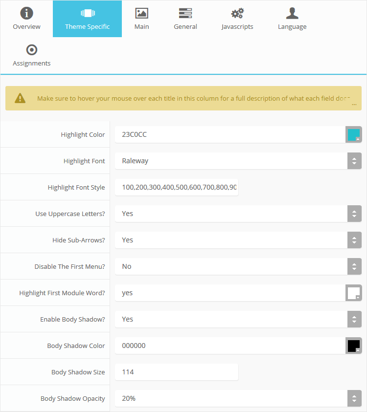
Custom Highlight Colors
Stylize your site with any color you want. Set your own custom color scheme with the built in highlight color. This controls menu items, titles, buttons, hover over effects, backgrounds, and much more. You can set this color to any color that you want. In addition, you can set the background color of any row and the background color of the main body via the default Vertex features. Use the links under the Styles menu item to see some live examples.
Custom Highlight Font
Choose a custom highlight font powered by Google fonts. You can set a custom font for the titles, buttons, and much more. This is used in conjunction with the default site font which is controlled under the Layout tab of Vertex, and controls many other elements as well.
Uppercase Letters
Choose to enable or disable uppercase letters on most menu items, buttons, titles and more.
Hide Menu Arrows and First Menu Item
With this option you can disable the menu item sub menu arrows on first level parent items. There is also an option to hide the first menu item entirely.
Menu Titles
Enable or disable the highlight color on the first word on most module classes.
Body Shadow
Around the edge of the main body there is shadow effect. You can disable this shadow or adjust its size, color, and opacity to any setting you would like.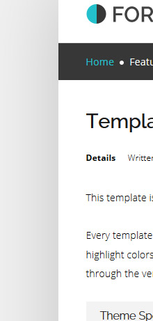
- Details
- Written by Admin
- Details
- Written by Admin